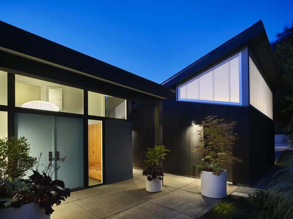
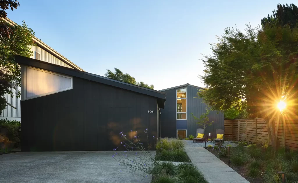
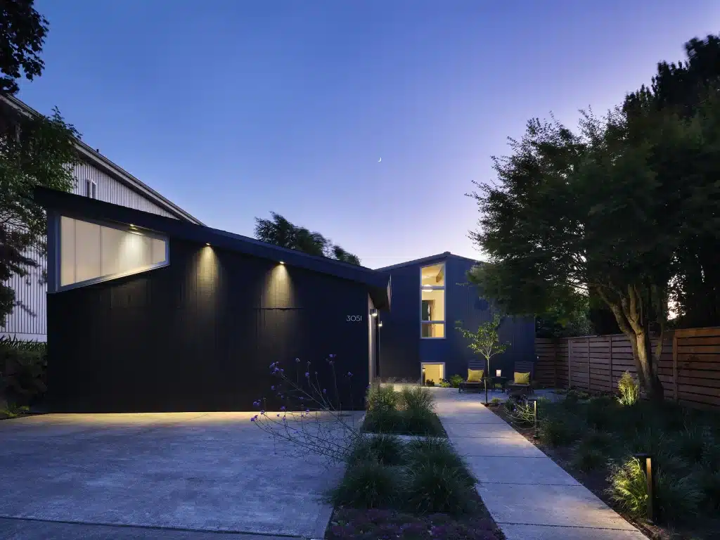
The owners of this Mid-Century Modern House wanted to open up the inside, but first, we had to make it possible to find the front door. It was buried halfway back in the site and hidden behind the garage. The only clue was a narrow walkway between the property line and the garage in the side yard.
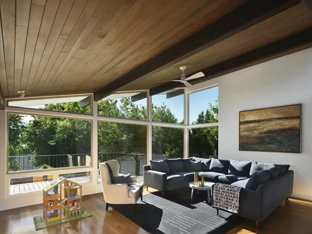
A 1961 split-level, the entry, kitchen, and dining room are on the main level, the living room and two bedrooms are upstairs, and a family room and two bedrooms are on the lowest level. The living room ceiling slopes down from a 12′ height to a massive brick fireplace (with a sunken conversation pit) and then continues over the dining room. There are exposed beams and a wood ceiling to complete the mid-century mood, but the rooms in the house feel disconnected.
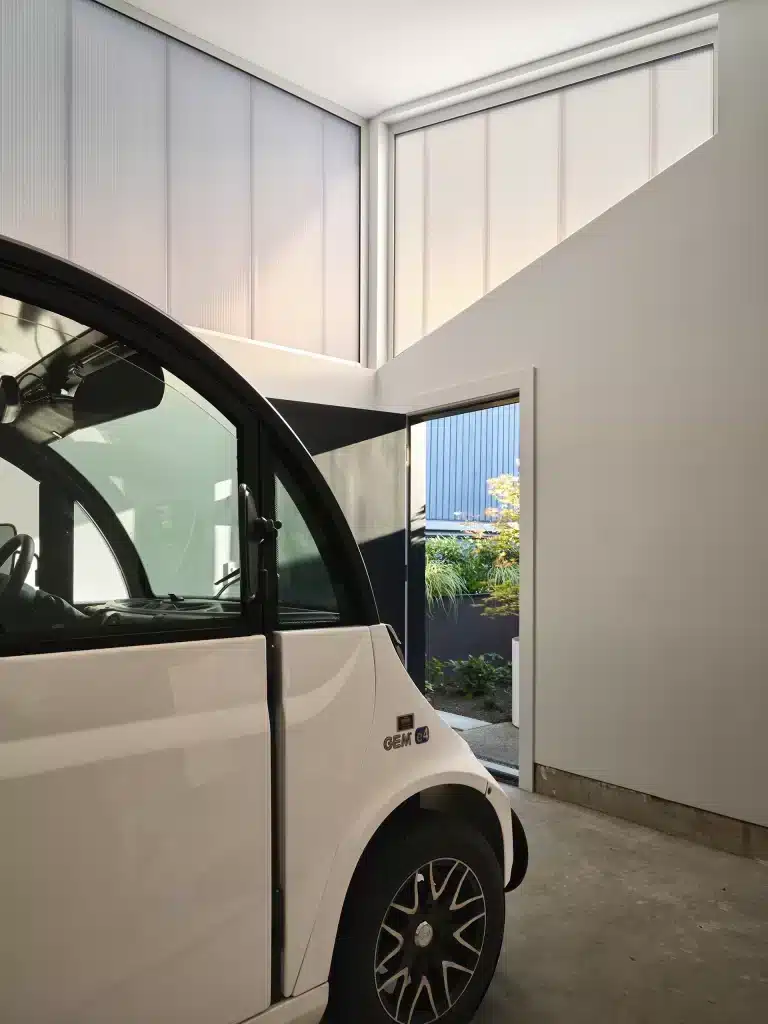
First, the attached garage was demolished and rebuilt to create space between the house for a landscaped walkway to the front door from the front yard. Now, a series of concrete pavers lead to an entry courtyard at the front door. The new garage is still prominent on the street, but the roof follows the slope of the existing house, and the materials and detailing give it a designed presence.
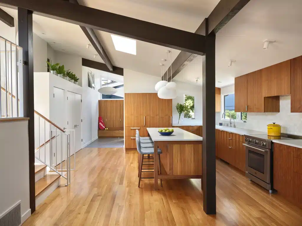
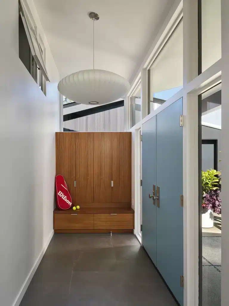
Steps to make the house more spacious begin at the entry hall. The wall of the adjacent utility room created an awkward restriction on access to the rest of the house. So the washer and dryer–not a good idea next to the front door in any scenario–moved downstairs, and the wall got pushed back, forming a closet. Since it’s a closet, the wall didn’t need to extend to the ceiling, creating further openness.
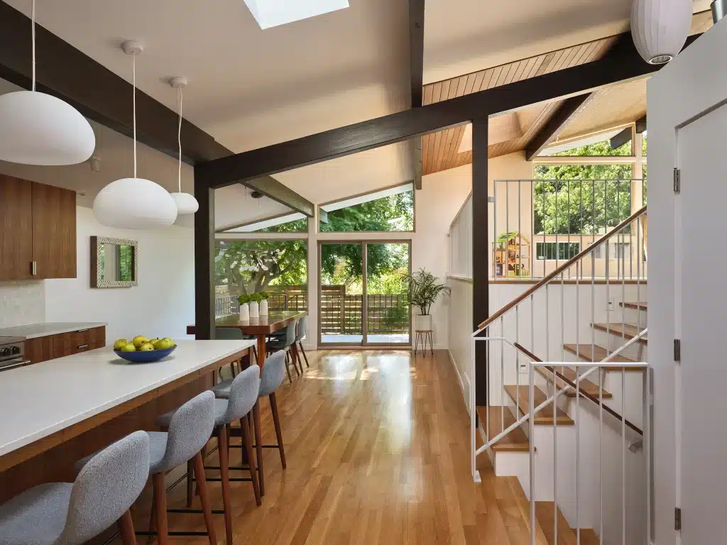
The layout flipped in the kitchen, and the cabinets now line the exterior walls, and the interior walls, once blocking it from the dining room and living room, are gone. The new kitchen is the heart of the house, and the design supports how this family cooks and spends time together with areas for baking, cleaning up, and kids’ school supplies. Adding a small window toward the entry courtyard makes it feel more connected and welcoming to visitors.
The most dramatic change for the house is the removal of the brick behemoth of a fireplace. Plus, the ankle-twisting conversation pit is gone! While the interior spaces now connect, they still have distinct personalities due to the changes in the ceiling heights. New skylights and the tweaks to the upper walls make for a varied and sunny spatial experience.
